


New Logo
+8
Wallyuph
Joe73
Mcarlo77
dynchel
Hawk03
Limey SE
1973montec
77mali
12 posters

New Logo
![]() by driveit Tue Mar 03, 2015 5:19 am
by driveit Tue Mar 03, 2015 5:19 am
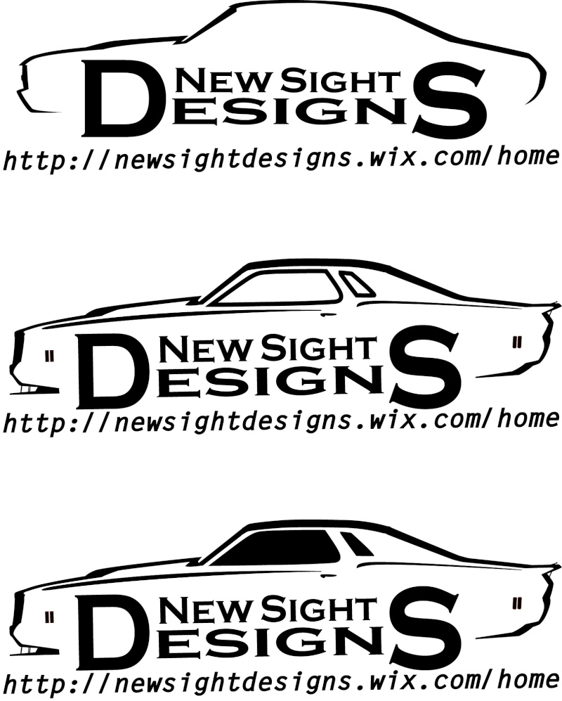
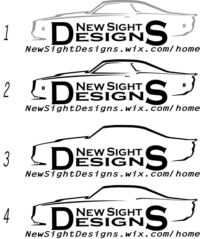
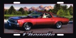
Been thinking of updating my logo for a long time. The top one if my original and the other two are the new ones, the bottom one is my preferred. Let me know what you think!

driveit- Donating Member

- Street Cred : 15
Re: New Logo
![]() by Joe73 Tue Mar 03, 2015 7:09 am
by Joe73 Tue Mar 03, 2015 7:09 am
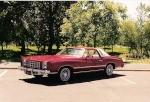
Id go with the.second or third one. Although all look great. The top one is a 70-72 chevelle body. Lol

Joe73- Donating Member
- Street Cred : 83

77mali- Donating Member
- Street Cred : 62


Re: New Logo
![]() by Hawk03 Tue Mar 03, 2015 9:53 am
by Hawk03 Tue Mar 03, 2015 9:53 am
Keep the top one. You want people to remember the name not the design or detail of the car in the background. The bottom two are too busy and take away from your name.
Keep it simple. You might also want to decrease the font on the D & S bookend letters. It looks like it reads New Sight Esign.
Keep it simple. You might also want to decrease the font on the D & S bookend letters. It looks like it reads New Sight Esign.

Hawk03- G3GM Enthusiast

- Street Cred : 18
Re: New Logo
![]() by Mcarlo77 Tue Mar 03, 2015 7:48 pm
by Mcarlo77 Tue Mar 03, 2015 7:48 pm
I tend to share Hawk's opinion since you're appealing to a broad range of car/truck owners.
Mcarlo77- Donating Member
- Street Cred : 77
Re: New Logo
![]() by Dinomyte Wed Mar 04, 2015 12:07 am
by Dinomyte Wed Mar 04, 2015 12:07 am
Good on you for asking. So many small business people take the logo they like and don't ever ask. It's a logo, just like any other tool. Pick the one that's best for the job. I'd say stick with the original, it's simple and elegant, it's not busy. I'd consider changing the web address capitals will make it easier to read, I've a number of times read it as news ight designs and had to re-read it.
NewSightDesigns.wix.com
www & http are understood.
/home ? Why is your website in a folder off the main folder?
Just my $0.02 worth.
NewSightDesigns.wix.com
www & http are understood.
/home ? Why is your website in a folder off the main folder?
Just my $0.02 worth.
Dinomyte- Donating Member
- Street Cred : 11
Re: New Logo
![]() by knightfan26917 Wed Mar 04, 2015 6:33 am
by knightfan26917 Wed Mar 04, 2015 6:33 am
Hawk03 wrote:Keep the top one. You want people to remember the name not the design or detail of the car in the background. The bottom two are too busy and take away from your name.
Dinomyte wrote:Good on you for asking. So many small business people take the logo they like and don't ever ask. It's a logo, just like any other tool. Pick the one that's best for the job. I'd say stick with the original, it's simple and elegant, it's not busy.
I agree with Hawk & Dinomyte. Best to stay simple. While I like the detail in the bottom one, it takes away from the name & makes it seem like you're just targeting those vehicles. The top one ... is way more general.
Cort
1979 & 1989 Caprice Classics | pigValve, paceMaker, cowValve
"Simple little things are the miracle cures" __ Neal McCoy __ 'Wink'

knightfan26917- G3GM Senior Member

- Street Cred : 8
Re: New Logo
![]() by driveit Thu Mar 05, 2015 1:33 am
by driveit Thu Mar 05, 2015 1:33 am
Here are a few more ideas.
I took some of your advised to heart and made a few changes. I will be keeping the D and S larger as it was my attempt at making those letters seem like wheels on the cars outline. I thought it was clever, but some don't even pick up on it. Let me know your thoughts.
I took some of your advised to heart and made a few changes. I will be keeping the D and S larger as it was my attempt at making those letters seem like wheels on the cars outline. I thought it was clever, but some don't even pick up on it. Let me know your thoughts.
driveit- Donating Member
- Street Cred : 15
Re: New Logo
![]() by Joe73 Thu Mar 05, 2015 6:41 am
by Joe73 Thu Mar 05, 2015 6:41 am
I like the first one. Definitely highlights the name and web site but still has a nice sporty car effect in the background.
The third is a little plain and the forth a bit better.
Love the whole concept of the design.
The third is a little plain and the forth a bit better.
Love the whole concept of the design.
Joe73- Donating Member
- Street Cred : 83
Re: New Logo
![]() by knightfan26917 Thu Mar 05, 2015 7:18 am
by knightfan26917 Thu Mar 05, 2015 7:18 am
driveit wrote:Here are a few more ideas.
Cool ... of these, I like #3 the best ... still have the outline & retain the simple nature. That noted, however, the 1st is a bit more intriguing because the car outline is faded ... so that it isn't as prominent in the logo.
driveit wrote:I took some of your advised to heart and made a few changes. I will be keeping the D and S larger as it was my attempt at making those letters seem like wheels on the cars outline. I thought it was clever, but some don't even pick up on it.
Ah, OK. In that case, I wonder if it would be a bit clearer for those that don't pick up on it if you'd move the "new sight" to above the "D" & "S". For instance, in the 3rd pic, place "new sight" where the door & rear opera windows would be....
Cort
1979 & 1989 Caprice Classics | pigValve, paceMaker, cowValve
"That's the price that we all pay" __ New Order __ 'True Faith'
knightfan26917- G3GM Senior Member
- Street Cred : 8
Re: New Logo
![]() by Dinomyte Thu Mar 05, 2015 9:16 am
by Dinomyte Thu Mar 05, 2015 9:16 am
3 looks simple understated and more like it's a design shop rather than a hot rod shop. Remember you want to attract folks that want a design done, not those that think you do just car designs.
Speaking of speed shops So-Cal Customs is a perfect example, their logo is simple elegant and sticks in your mind but doesn't scream car, not to mention you see other things and are reminded of it.
The Japanese Ying & Yang
A surf board
Just my thoughts at 8am without coffee. . .
Speaking of speed shops So-Cal Customs is a perfect example, their logo is simple elegant and sticks in your mind but doesn't scream car, not to mention you see other things and are reminded of it.
The Japanese Ying & Yang
A surf board
Just my thoughts at 8am without coffee. . .
Dinomyte- Donating Member
- Street Cred : 11
driveit- Donating Member
- Street Cred : 15
Re: New Logo
![]() by driveit Mon Mar 09, 2015 8:14 pm
by driveit Mon Mar 09, 2015 8:14 pm
Had a new idea. Was thinking that it might be cool to have multiple variations of my logo to match each vehicle type. They would all have the same font type and same feel so it would be unmistakable for the same company or artist. Thoughts?
driveit- Donating Member
- Street Cred : 15
Re: New Logo
![]() by Dinomyte Mon Mar 09, 2015 10:45 pm
by Dinomyte Mon Mar 09, 2015 10:45 pm
Consistency is KING !!! One logo, one design otherwise people get confused as to what you really are. At most one colour and one black & white (for things like faxes or rubber stamps)
Take a look at many of the big companies, Home Depot, IBM, Staples etc. . . They have the budget to have a different logo for each store but they want people to know it's one and the same each and every time.
Take a look at many of the big companies, Home Depot, IBM, Staples etc. . . They have the budget to have a different logo for each store but they want people to know it's one and the same each and every time.
Dinomyte- Donating Member
- Street Cred : 11
Re: New Logo
![]() by Wallyuph Tue Mar 10, 2015 12:23 pm
by Wallyuph Tue Mar 10, 2015 12:23 pm
Dinomyte wrote:Consistency is KING !!! One logo, one design otherwise people get confused as to what you really are. At most one colour and one black & white (for things like faxes or rubber stamps)
Take a look at many of the big companies, Home Depot, IBM, Staples etc. . . They have the budget to have a different logo for each store but they want people to know it's one and the same each and every time.
Could not have said it better.
Here's a little story for you. My Wally s Upholstery logo was done in 1993. The first year I was doing in home service for the St Paul/ MPLS metro area. I put on almost 30K that first year. My brother took my car to a show way south of my home location. At the show I had my sign with logo for Wally's Upholstery. 3 guys came up and said I see those trucks allover the place they must be pretty big. My brother laughed and said its just my little brother and his one truck. So you see its all about Constancy and recognition.
Here is the logo that has not changed since 1993 to present.
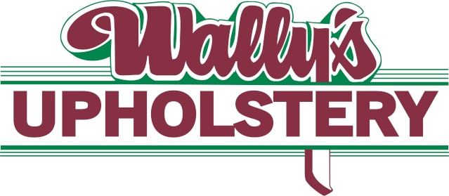 " />
" />I feel big corporate has it all wrong and changing every thing.
Wallyuph- Donating Member
- Street Cred : 31
Re: New Logo
![]() by Dinomyte Tue Mar 10, 2015 12:59 pm
by Dinomyte Tue Mar 10, 2015 12:59 pm
Thank Wally !! I've got a similar story.
Red Box Computer Solutions was started in '05 by me on my own. One day i was in the local hospital which we'd provided LCD displays to. One of the big wigs in the department that was involved in the process of purchases, but not directly saw me with the logo on my golf shirt. Made a point of coming over, introducing himself and asking if we were international? I had to own up and tell him we were Canada wide, as I'd sold something to my brother-in-laws work in B.C.

Unchanged in 10 years.
Also just for the record we have a black and white logo fro faxes, but have a red and white logo as a rubber stamp, figured black was just wrong for a company called Red Box.
Hope this helps. Have you considered getting in touch with your local Small Business Centre? They would be a wealth of information, advice, probably even classes about marketing and so on. There may even be financial assistance that you might qualify for.
Red Box Computer Solutions was started in '05 by me on my own. One day i was in the local hospital which we'd provided LCD displays to. One of the big wigs in the department that was involved in the process of purchases, but not directly saw me with the logo on my golf shirt. Made a point of coming over, introducing himself and asking if we were international? I had to own up and tell him we were Canada wide, as I'd sold something to my brother-in-laws work in B.C.
Unchanged in 10 years.
Also just for the record we have a black and white logo fro faxes, but have a red and white logo as a rubber stamp, figured black was just wrong for a company called Red Box.
Hope this helps. Have you considered getting in touch with your local Small Business Centre? They would be a wealth of information, advice, probably even classes about marketing and so on. There may even be financial assistance that you might qualify for.
Dinomyte- Donating Member
- Street Cred : 11
driveit- Donating Member
- Street Cred : 15
Re: New Logo
![]() by knightfan26917 Wed Mar 11, 2015 4:13 am
by knightfan26917 Wed Mar 11, 2015 4:13 am
Dinomyte wrote:Consistency is KING !!!
Indeed.
driveit ... looking forward to seeing which logo you decide to use!
Cort
1979 & 1989 Caprice Classics | pigValve, paceMaker, cowValve
"Swinging for the bleachers in the 9th inning" __ Michael Martin Murphy __ 'Still Taking Chances'
knightfan26917- G3GM Senior Member
- Street Cred : 8

Dead Man- G3GM Member

- Street Cred : 4
Re: New Logo
![]() by driveit Tue Apr 07, 2015 2:44 am
by driveit Tue Apr 07, 2015 2:44 am
Sorry I haven't been on in a while. I have a decided on the logo. Check out the full set below.

driveit- Donating Member
- Street Cred : 15

 Similar topics
Permissions in this forum:
You cannot reply to topics in this forum|
|
|
» 1973 4 door laguna frame same as 1973 2 door chevelle
» Dash assembly for 73-77 Malibu/Monte/El Camino,etc.
» Window louvers
» 1973 Chevelle SS 1 Family
» 1973 Chevelle SS, 350, 4spd. build
» Who works on 73-77 "soft" steering wheels?
» Blue door jamb sticker
» Factory am/fm
» Factory am/fm